SEARCH

Search

Explore

Blog
Podcast
Free Live Event
Self-Assessment
Manifesto
Book

Work with me

Connect

SUBSCRIBE

Search
Close this search box.

How good are your detective skills?

Unfortunately, Lord Smithe has been murdered. Can you help the inspector find out who murdered him?

Do yourself a favor and watch the video first before you continue to read.

The video makes change blindness real. Change blindness is the phenomenon that we can’t detect changes if they are outside of our attention frame.

The ad allowed us to make that experience. We experienced how it feels like if we’re being change blind. (I bet that you didn’t see all 21 changes, did you?)

You are change blind. Just as I am.

Just as everyone else is.

Which is the crucial part: Our audience’s attention is just as scarce as ours. Overwhelming them with info or with a busy layout on our website will lead them to miss some of what we say. Or just think of all the overly busy PowerPoint slides that you’ve seen. We can only focus on one thing at a time, either listening to the speaker or reading the slides. And so, with busy slides, we’re almost guaranteed to miss parts of the presentation.

As a rule of thumb, the most useful assumption that we can make about our audience’s attention is that they can focus their attention on only one thing at a time.

Which means: We’re having a choice here. We can design the space, the medium, and the delivery in a way that we remain in control of where the attention goes.

Now, be honest, how many changes did you spot in the video?
What does it look like?

If you’ve ever played Monopoly, you know what it feels like to play the game.

Which is the point of this brilliant new campaign by KesselsKramer. They want us to be reminded of what it feels like to play Monopoly by showing us what playing the game looks like.

Yep, this is us. (Isn’t it?)

Most business communication is different. It stops at what but doesn’t show us what it looks like.

The business tells me about their latest innovation and why it works.

But is it for me?

Sure, they explain … and continue to tell me how elaborate their approach is.

But is it for me?

They let us figure this out ourselves.

As opposed to making us see what it looks like to struggle so that we can immediately identify as their customer.

Yep, this is us. This is exactly what we’re struggling with.

If you want to be seen by your customer, see them first. And tell them what you see … what does it look like?

When they recognize themselves, they will want to hear the details.

(PS: Speaking of board games, I enjoyed this video about “The Politics of Competitive Board Gaming Amongst Friends”)

Can you draw it?

Because when you can draw it, it means you can see it.

And when you can see it, it means that it’s concrete.

What you think can be abstract, but what you see (or even draw) is concrete. Which is a huge bonus when you want me to see it, too.

When you think “We’re innovative”, it can mean very specific things to you. At the same time, it means nothing to me. Or at least something completely different than you think it does.

But when you show (or at least tell) me what innovative looks like, we can look at it together. And I can much more easily tell whether I see the same as you do … and whether I like what I see.

What does it look like when you “improve the process”?

What does it look like when you “increase production quality”?

What does it look like when “we perform better as a team”?

Can you draw it?

Accurate beats nice

In data visualisation, accurate beats nice every single time.

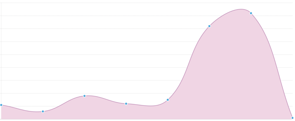
The designers of this chart thought it would look nicer to have rounded curves in between data points:

Only that the chart, which visualizes downloads per day, is now inaccurate. It suggests that the peak number of downloads is here:

when, in fact, it’s not. The peak is exactly at the blue spot to the right of the arrow. Since this is a visualization of a discrete data set (downloads per day), in fact, there are not even any data points in between the blue points at all. It just doesn’t make sense to assume that any day could lie between two consecutive days. Therefore, it’s inappropriate to suggest that higher data points exist. They can’t. They don’t. The max number of downloads is at the position of the blue spot to the right of the arrow.

By trying to make the chart look more beautiful, the designers have made it wrong. They’ve compromised accuracy for the sake of making it look nicer. And so they destroy trust in the data.

When in doubt, always choose accuracy. Trust isn’t created by beauty, it’s created by saying what you mean. This chart doesn’t say what it means. (The irony being that to me an accurate chart would look just as nice, just not with rounded curves; clearly a personal taste thing.)

Consistency vs. Stagnation

There’s a fine line between consistency in your actions and stagnation.

Stagnation is almost inevitable when you act the same way over and over again. You figured it out once, and repeat it over and over. It’s consistent and thus, inflexible.

Here’s a different kind of consistency: If you act according to the same principles over and over again, your actions can vary, probably by a lot. It’s consistent and thus, flexible.

While the former might be the recipe for a failing business, the latter is invaluable for building a sustainable business.

8 million

Each year, more than 8 million children die due to poverty (source).

That’s a huge number. But how large is it, really? The human mind has no easy way to “see” that number. For our brain, it doesn’t make much difference whether it’s 8 million or 80 thousand. Both is basically “a lot”.

Things change when we translate the numbers into dimensions we can relate to. 8 million per year means that every 4 seconds a child dies due to poverty.

Basically, during the time it takes you to read this sentence, a child dies due to poverty.

4 seconds is an easy to grasp value. 4 seconds is easy to experience. It has a clear meaning in our everyday life and therefore, it makes the abstract specific. It’s still the same information, but it’s much more tangible – even more so when you support it with a finger snap.

It’s hard to see 8 million children, but it’s easy to imagine one – which is precisely what most of us do when we hear that finger snap. With each finger snap we see a child.

Translating difficult numbers into values that make sense in our everyday life also makes it a lot easier for our audiences to understand what the numbers mean. It makes it a lot easier to relate to the info we’re trying to convey.

In the moment

The best camera is the one you have with you. For most of us that’s our phone, nowadays. I’m glad that these cameras are at a level that allows me to capture beautiful scenes like the ones below from our family trip. We took a few days off to relax, go for some walks, and enjoy just being in the moment.

Here are some impressions from that trip.

Will it break?

Quite early in our lives we learn that porcelain breaks when it drops onto the floor.

A fact, that one of my clients used to great effect in one of his presentations. He was speaking about their new sensors which were made of porcelain – as opposed to metal.

You might wonder how durable porcelain as a material is.

Well, quite durable.

His presentation was right after the coffee break. So, he brought his (empty) cup of coffee with him. He spoke a bit about the drawbacks of metal surfaces.

Then he took the cup. Told the audience that the new sensors were made out of porcelain. Walked a few steps towards a table.
And. Smaaaashed. The cup. Against. The. Table.

BAM!

The whole audience held their breath. Did he really just smash that cup?

Well, no, he didn’t! Because the cup endured. Porcelain is, in fact, quite a bit more durable than we intuitively think – if you know how to handle it.

You can imagine that afterwards, the audience was quite eager to listen to the facts about the new material and how to make it work for them.

What are unexpected properties of your product? How could you demonstrate them?

We don’t have that problem. Our flies aren’t that big.

During the shooting of his film “The Flying Doctors of East Africa” Werner Herzog made an interesting discovery about how humans perceive images (emphasis mine):

One of the doctors in the film talks of showing a poster of a fly to the villagers, who had never seen photographs or images of any sort. “We don’t have that problem,” they said. “Our flies aren’t that big.” It was a response that fascinated me, so we took the posters – one of a man, one of a human eye that filled an entire piece of paper, another of a hat – and conducted an experiment. I asked if they could identify the human eye, and most of the villagers couldn’t; the images were just abstract compositions to them. One man thought the window of the hut was an eye, and another pointed to the eye and said, “This is the rising sun.” It was clear that certain elements of visual perception are in some way culturally conditioned, that these people were processing images differently to how Westerners might.

Obviously, “cultural conditioning”, as Herzog calls it, plays a major role in how we perceive, decode, and understand images. We should not assume that these differences are relevant in the African steppe, only.

The media we consume, the conversations we have, the experiences we make, these all contribute to our cultural conditioning. How we see an image is influenced by this conditioning – apparently up to the degree that it’s not even given that we see the same things in an image. Let alone, decode their meaning in the same way.

So, if people don’t get the joke of our clever marketing campaign, it might be that they didn’t even have a chance to get it. They were conditioned differently and so they see the image differently.

(Of course, on the flip side, this can be turned into a powerful tool to address a specific group of people who you know will get the joke.)

How to burn a message into someone’s head

Can you plant a thought in someone else’s head? In the film Inception, Leonardo diCaprio attempts to do so by entering the dreams of his target mind. It’s the stuff that a great Hollywood blockbuster is made of.

But what if you could actually manage to get a message literally right into your audience’s head? Impossible? Not for BMW. How the carmaker used afterimages to literally burn its brand into the eyes of an audience has a simple explanation, but it’s still outstanding:

Spread the Word

Picture of Dr. Michael Gerharz

Dr. Michael Gerharz